#
User Interface
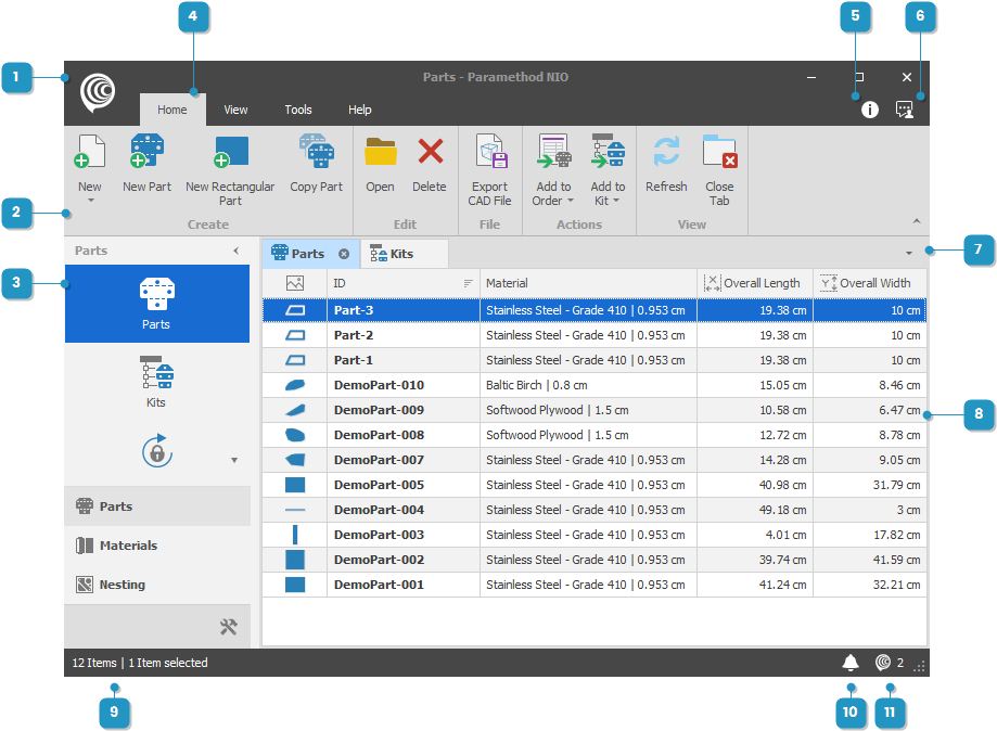
NIO uses the familiar ribbon layout introduced by Microsoft Office. You will feel immediately proficient in navigating its content. The top portion of the interface is a collapsible ribbon adapting the available actions according to the main view being worked on. Docked on the left is the module navigator that can be completely hidden or collapsed allowing more space for the main view. The main area of the screen is a tabbed layout, allowing multiple views opened at once and docked side-by-side. Finally, at the bottom a status bar shows the status message and indicators for notifications and background-running jobs.


